

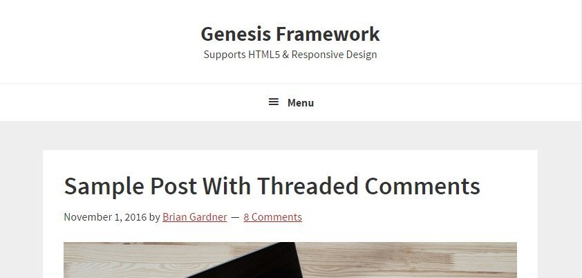
If you’re a Genesis Framework user, you may have noticed that the responsive menu in the Genesis Sample theme resides below the header. But, what if you want to relocate it to the inside header so it’s aligned to the right of your site header while the site title is aligned left?
Sridhar Katkam’s Genesis Starter Child Theme which was released in 2016, has added some cool new features. In fact, these days, I use his version of Genesis Sample theme rather than the original Genesis Sample theme available on StudioPress. If you’re not aware of the modified theme, you should check it out here.
One of the major structural changes in Sridhar’s starter theme is that it uses WordPress’s default blog template rather than the blog template offered in Genesis Sample. If you’re wondering why, then you should probably read Bill’s blog post.
What I really like about theme is the Inline Mobile Responsive Hamburger menu. Therefore, I’d highly recommend using Sridhar’s Genesis Starter Child theme for your custom project if you want to do it right.
First, remove or comment out the Following Line from Your Functions.php. It should be found on Line 117
add_theme_support( ‘genesis-menus’, array( ‘primary’ => __( ‘After Header Menu’, ‘genesis-sample’ ), ‘secondary’ => __( ‘Footer Menu’, ‘genesis-sample’ ) ) );
Then, add the following code snippet in your functions.php.
https://gist.github.com/topleague/92fc12bf4ee6a97dda5ed0b490971c85
Add the following code at the bottom of your CSS file. If you don’t want to make any changes in your CSS file, consider adding the code to WordPress’ Additional CSS template.
https://gist.github.com/topleague/e8ce3764edda99f5f3fdbbaaff3c39be
That’s it. You should now see a hamburger responsive menu in all its glory. Want to see it in action? Resize your browser and see my blog.
Let me know if you have any questions.
Note: Depending on your particular theme, you may have to make a slight modification in the above code to match your theme design.
Comments
3 responses to “How to Relocate Responsive Menu in Genesis Sample”
Thank you. I have done but no change.
Thanks for informing me about the issue. Just updated the post. Please, try it and let me know if you have any questions.
Its not working.
I use my theme genesis sample, and nothing was happend.
I use your theme genesis sample master zip ( 2016 ver ), and nothing happend.
I use your theme genesis sample master zip ( 2017 new update ver) and still nothing.
Can you help me, to make my responsive menu look like this website. Thanks.